Table of Contents
Ai Modules
Constant
| section | Controller |
|---|---|
| short description | allows to set a value - either static or with a control which can be exposed to the GUI or via Midi/Artnet In order to make the control available via Midi or Artnet right-click th control and select Edit Midi Map resp Edit Artnet Map. |
| licence level | Anjuna |
| ports | Out [numeric/control] |
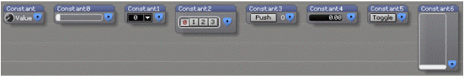
| skins | HSlider, Knob, List, MultiButton, PushButton, Text, ToggleButton, VSlider |
used in example
Manual
Outputs a user defined numeric value according to the value range and control type selected. The number value is stored internally as a 64-bit floating point number.
Skins and their options
Knob
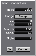
By default, the knob is a standard rotary knob, with a limited range, outputting values from 0 to 1. This can be changed in the control properties (Ctrl + right-click). In order to operate the know with the mouse click it, and with the mousebutton held down move the mouse left and right. It is not possble to change the knob's size.
HSlider
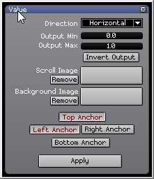
This displays a horizontal slider which can easily be set with the mouse or touchscreen. The default range is from 0 to 1, The slider can be resized, and images for background and slider knob can be selected in the properties menu:
List
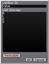
Shows a dropdown list. The size of the list (width and height) can be adjusted. The elements of the list can be defined in the oprions menu. The output is always the 0-based index of the selected item: let the list have the elements A, B, C, D, E, F. If A is selected then the output is 0, with E selected the output is 4.
MultiButton
Shows a row with 4 interlocking buttons. If one button is pressed, any other previously selected button is released. The output is the 0-based index of the selected button. There are no options for this control (or the menu doesn't work).
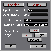
PushButton
Displays a button which can be clicked (mouse/touch/midi/artnet). If the button is engaged the output is 1, else it is 0. By default the button does not latch - this can be enbaled in the properties. Also the label on the button can be set. The button can be resized.
Text
Shows an input field. This can be resized, and the allowed format can be set in the control properties. The default is Float sot that positive and negative decimal numbers are expected.
ToggleButton
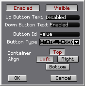
Displays a button which can be clicked (mouse/touch/midi/artnet). Similar to the PushButton above, only that the properties are preset to a latching bahviour which can be altered in the properties. The button can be resized. Outputs 0 (unlatched) or 1 (latched).
VSlider
Similar to the HSlider (above), only with the default orientation set to vertical. Displays a vertical slider which can easily be set with the mouse or touchscreen. The default range is from 0 to 1. The slider can be resized, and images for background and slider knob can be selected in the properties menu:
